PepsiCo OneRoster Resource Management Platform
Consolidating fragmented dashboards and HR management tools into a cohesive, scalable enterprise system used by organizational leaders across multiple teams.
Role
Lead Product Designer, solo
Scope
Information architecture, dashboard design, PowerBI constraints, design system adaptation
The Real Starting Point
The original request was straightforward: Refresh existing dashboards in PowerBI using the PepsiCo design system.
The reality was more complex.
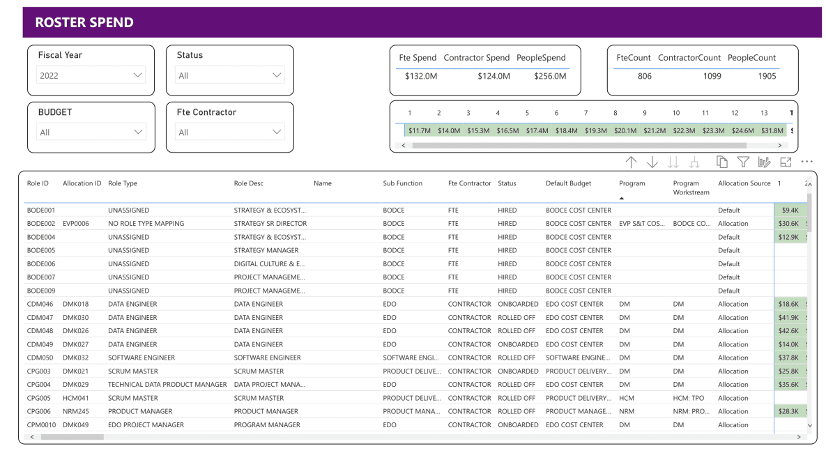
The experience was split across two disconnected applications. Dashboard views were fragmented across nearly 20 tabs. Allocation data, role information, and employee management lived in separate silos. Leaders managing headcount and budget were forced to jump between tools to answer basic questions.
The issue wasn’t visual polish. It was structural.

MVP Under Constraint
The MVP mandate was clear: leverage existing data as-is and modernize the interface.
Rather than simply restyle dashboards, I conducted an inventory of all views and mapped their use cases. Many tabs contained overlapping or lightly differentiated data.
Through stakeholder workshops and usage discussions, we restructured the information hierarchy from nearly 20 fragmented tabs to 7 structured dashboards organized by decision type.
This preserved all existing data while dramatically improving navigability.
Designing Within PowerBI
A major constraint of this project was the technical platform. PowerBI offered limited flexibility in component behavior, spacing, and styling, making strict adherence to the PepsiCo Design System impossible.
Instead of forcing visual parity, I prioritized:
• Functional clarity over pixel perfection
• Consistent layout logic even where styling diverged
• Early collaboration with engineering to avoid downstream rework
By aligning on constraints early, we prevented design debt and ensured the final product was both feasible and maintainable.
This project reinforced the importance of designing with the platform, not against it.
A New Audience, A New Layer
In addition to restructuring existing dashboards, senior leadership required a high-level overview screen.
Using existing data, I introduced a consolidated executive view that surfaced:
• Headcount breakdowns
• Geographic distribution
• Cost trends over time
This layered model allowed team leads to work at the operational level while leadership engaged at the strategic level without duplicating data structures.


Beyond Dashboards: Unifying People Management
While dashboards were in development, I simultaneously explored structural issues within the HR side of the application.
Allocation data, role definitions, and employee records were displayed across separate screens, requiring constant back-and-forth navigation to manage a single report.
I proposed a unified employee detail view that consolidated these data streams into a single surface, giving managers full context in one place.
Although this integration extended beyond the MVP scope, it shaped the long-term product vision.
Outcomes
Reduced dashboard sprawl from ~20 tabs to 7 structured views while retaining all legacy data.
Aligned dashboard architecture with real decision workflows rather than report categories.
Introduced executive-level visibility without creating redundant reporting structures.
Established a scalable structural foundation for future integration between dashboards and people management.
Personal Reflection
This project reinforced that enterprise dashboard design is rarely about charts. It is about hierarchy and decision flow.
If I were extending this further, I would deepen the integration between dashboards and employee detail views, allowing drill-down transitions that connect high-level trends directly to individual allocation decisions.
Working within PowerBI also strengthened my ability to balance ambition with feasibility. Designing effectively under platform constraints requires flexibility, negotiation, and clarity around what truly drives user value.